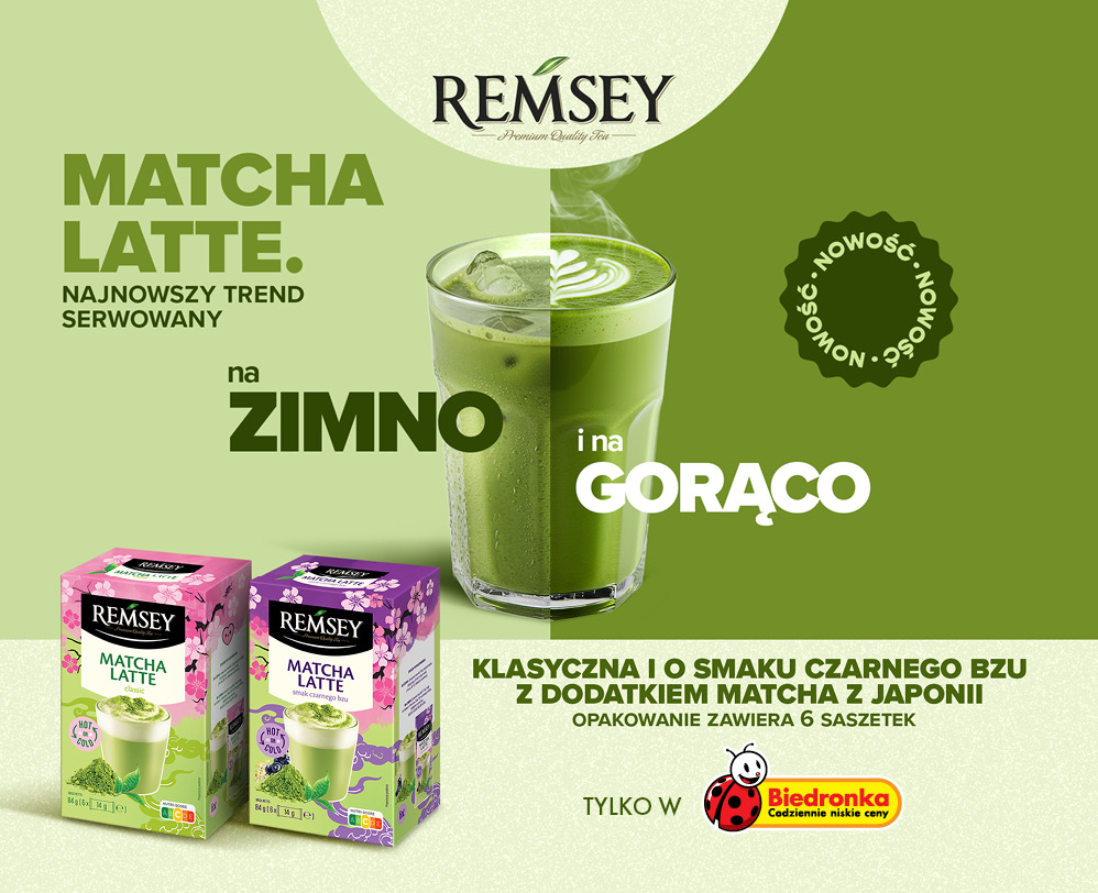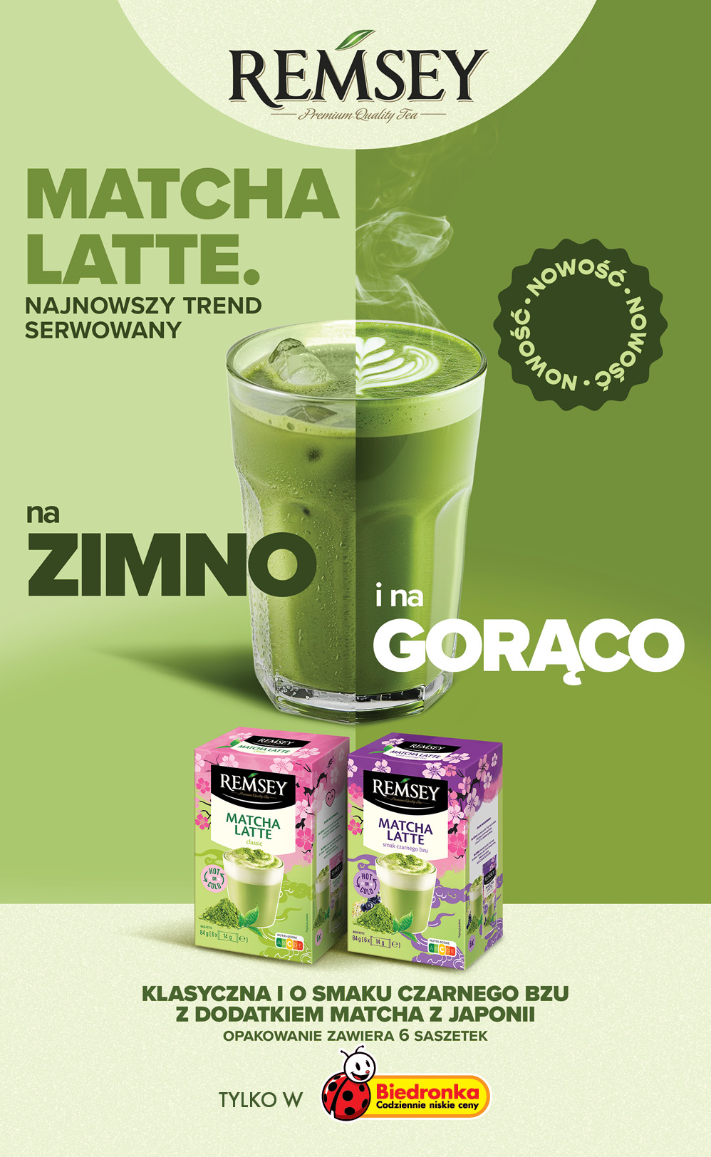
This project was nice an excuse to make a very visually pleasing layout for Matcha.
The idea was to simply show the Matcha Latte can be enjoyed both hot and cold.
I tired to follow a lot of the current trends but also keep it aligned to Biedronka branding.
I love the colour green, so it is always a winner for me personally.
Print materials for weekly promotional layouts were the outcome.
This was made using images from stock and them comped in Photoshop.